
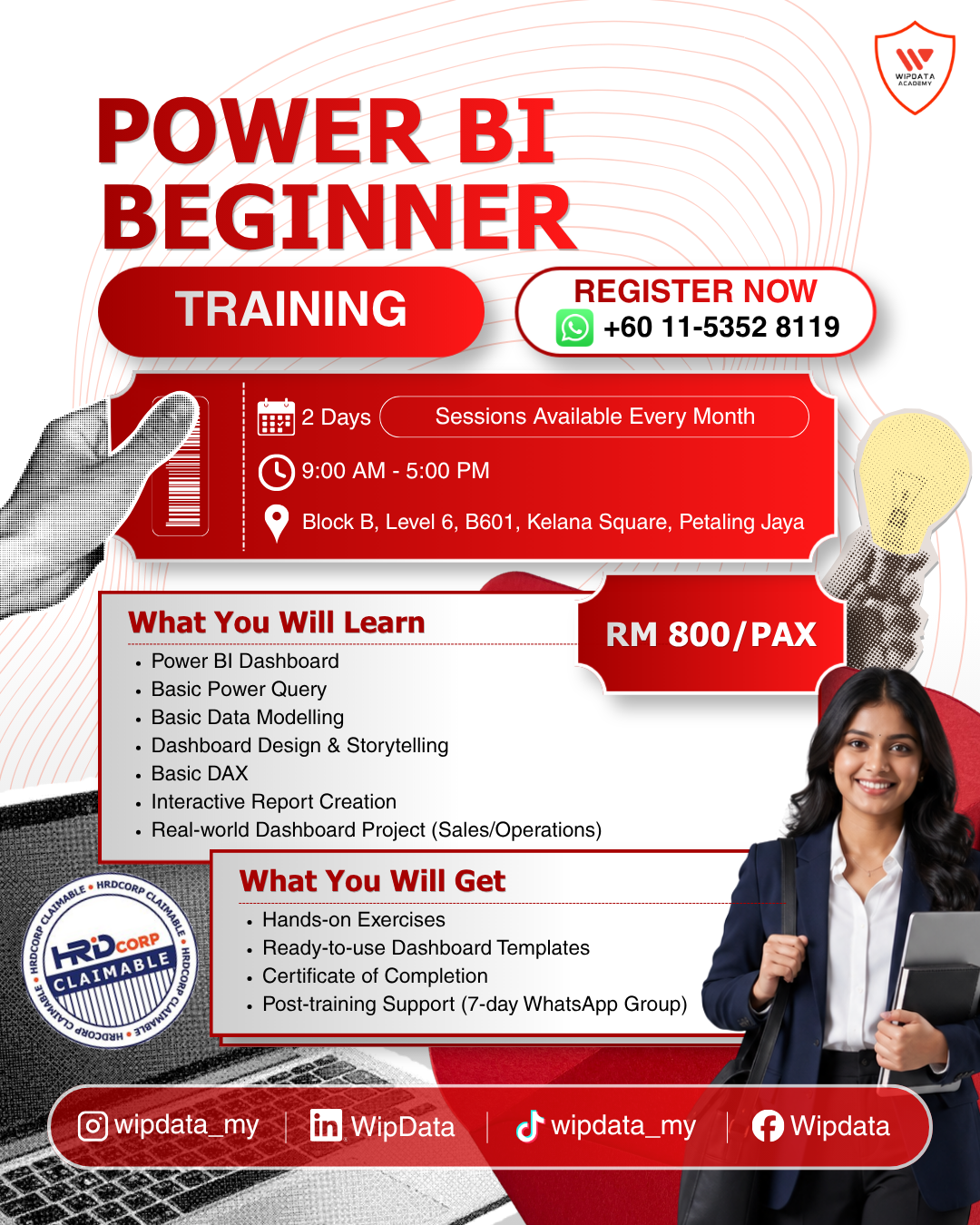
Power BI Beginner
RM800.00
Description
Duration: 2 days
Course Overview:
Microsoft Power BI is the world's leading Business Intelligence platform, and it is now accessible to everyone, not just data professionals. Whether you are an executive who receives weekly reports and wants to build them yourself, an operations manager tired of waiting for the IT team to update a spreadsheet, or an HR professional who wants to see workforce data in a clear, interactive format, Power BI gives you the ability to connect to your data, clean it, and turn it into meaningful, visual reports that update automatically. This two-day beginner programme is designed specifically for professionals who have never opened Power BI before and want to build their first real report by the end of Day 2.
The programme is designed to be practical, encouraging, and entirely hands-on. Every concept is introduced with a plain-language explanation before participants apply it immediately to a real dataset. Day 1 establishes the foundation: understanding the Power BI interface, connecting to data sources, cleaning data with Power Query so it is accurate and consistent, and building a simple data model that connects related tables. Day 2 builds the analytical and visual layer: writing beginner-friendly DAX measures to calculate key numbers, creating and formatting charts and visuals, designing a clean two-page dashboard, and publishing the completed report to Power BI Service to share with colleagues.
By the end of Day 2, every participant will have built and published their own Power BI report from a real dataset, complete with calculated measures, interactive visuals, a formatted dashboard, and a shared link they can send to their manager. No coding, no advanced technical knowledge, and no prior analytics experience is required. This is Power BI for people who work with data every day and are ready to do something more powerful with it.
Audience:
Working professionals across all industries and functions who want to build interactive reports and dashboards in Microsoft Power BI for the first time. Suitable for executives, managers, analysts, HR professionals, finance staff, operations personnel, sales teams, and administrative staff who work with data but have no prior Power BI experience.
Prerequisite:
Basic computer literacy and familiarity with data in a table or spreadsheet format. No Power BI, coding, or analytics experience required. Microsoft Power BI Desktop must be installed prior to Day 1 (free download from microsoft.com/power-bi). A Microsoft account is required for Day 2 Power BI Service activities.
Methodology:
The programme will maximise understanding and learning through interactive lectures, Live Demonstrations, Step-by-step Guided Exercises, Hands-on Workshops, Peer Review, and a Capstone Report Build.
What you will get:
- Ready-to-use Power BI Dashboard Templates
- Step-by-step DAX Measures Reference Sheet
- Certificate of Completion
- Power BI Best Practices Cheat Sheet
- Hands-on Exercises with Real-World Datasets
- Access to Sample Dataset Used in Training
- 7-Day Post-Training WhatsApp Support Group
- Wipdata Academy Learning Pathway Guide
Objective:
- Navigate the Power BI Desktop interface confidently, connect to Excel and CSV data sources, and use Power Query to clean and prepare data for reporting.
- Build a basic data model by creating a relationship between two tables and write core DAX measures including SUM, COUNT, AVERAGE, DIVIDE, and IF to calculate business metrics.
- Create and format professional charts and visuals in Power BI and design a clean, well-organised two-page dashboard that communicates clearly to a business audience.
- Publish a completed Power BI report to Power BI Service, share it with colleagues, and export it as a PDF, producing a fully functional business report from scratch as a Capstone Project.
Course Module:
Module 1: Introduction to Power BI
- What is Business Intelligence and how Power BI fits in
- Power BI components: Desktop (where you build), Service (where you share), Mobile App
- Downloading and installing Power BI Desktop
- A guided tour of the Power BI Desktop interface:
- Report View: where you design visuals
- Data View: where you inspect your data in table format
- Model View: where you connect tables
- The Visualisations pane, Filters pane, and Fields pane explained
- The end-to-end Power BI workflow: Get Data, Transform, Model, Visualise, Share
- Power BI Free vs. Power BI Pro: what each licence allows
Module 2: Getting Data into Power BI
- The Get Data button: the starting point of every Power BI project
- Connecting to an Excel workbook: selecting sheets and tables
- Connecting to a CSV file
- Connecting to multiple files in a single Power BI report
- The difference between Load (straight to the model) and Transform Data (open Power Query first)
- Refreshing data: what happens when the source file is updated
- Understanding how data appears in Report View vs. Data View
- Viewing and navigating data in the Data View table
Module 3: Cleaning Data with Power Query
- What is Power Query and why clean data is the foundation of every accurate report
- Launching the Power Query Editor: navigating the interface
- Using Column Quality, Column Distribution, and Column Profile to spot data problems
- Promoting the first row as headers
- Changing data types: Text, Whole Number, Decimal, Date, and True/False
- Removing blank and null rows
- Removing unnecessary columns to keep the model lean
- Renaming columns for clarity and consistency
- Filtering rows: keeping only the data you need
- Replacing incorrect or inconsistent values
- Trimming extra whitespace from text columns
- Applied Steps: how Power Query records every transformation you make
- Closing and loading clean data back to the report
Module 4: Understanding Your Data Model
- What is a data model and why it matters for accurate reports
- Tables in Power BI: each table holds one type of information
- What a relationship is: connecting two tables on a shared column
- Navigating Model View: seeing how your tables connect
- Creating a relationship between a Sales table and a Products table
- Understanding one-to-many relationships in plain language
- What cardinality means and why the direction of a relationship matters
- Checking that relationships work correctly: using a visual to test
- Why you need a Date column: using dates for time-based reporting
- Hiding columns that report viewers do not need to see
- Common beginner data model mistakes and how to avoid them
Module 5: Your First DAX Measures
- What is DAX (Data Analysis Expressions) and why you need it
- The difference between a column (one value per row) and a measure (a calculation)
- Why measures are always the preferred way to calculate in Power BI
- Writing your very first measure: Total Sales = SUM([Sales Amount])
- Core DAX functions every beginner needs:
- SUM: add up all values in a column
- COUNT and COUNTA: count rows with values
- AVERAGE: find the average of a column
- MIN and MAX: find the smallest and largest values
- DIVIDE: divide two measures safely without divide-by-zero errors
- Creating a simple IF measure: categorise results as Above or Below Target
- Seeing your measure in action: testing it in a Card visual
- Organising measures in a dedicated Measures Table
- Naming your measures clearly so report viewers understand them
Module 6: Building Visuals & Charts
- The Visualisations pane: an overview of every visual type available
- How to build a visual: drag a field to the canvas or click the visual type first
- Bar chart and Column chart: comparing categories and values
- Line chart: showing how a measure changes over time
- Card visual: displaying a single important number prominently
- Pie chart and Donut chart: showing proportions — when to use and when to avoid
- Table visual: showing detailed data in rows and columns
- Matrix visual: the Power BI equivalent of a PivotTable
- Formatting a visual: changing colours, adding a title, showing data labels
- Adding a Slicer: letting report viewers filter data interactively
- How visuals cross-filter each other when you click on them
Module 7: Designing Your First Dashboard
- What makes a Power BI report easy to read and understand
- Planning your report before building it: what question does each page answer?
- Creating a second report page: using tabs at the bottom of the canvas
- Adding a title to your report page using a Text Box
- Arranging visuals in a clear, logical layout: summary at the top, detail below
- Sizing visuals consistently: using the Format pane to set exact dimensions
- Applying a consistent colour palette across all visuals
- Using a background colour or shape to group related visuals
- Adding company logo or branding using an Image
- Five beginner dashboard design rules that always improve readability
Module 8: Publishing & Sharing Your Report
- What is Power BI Service and how it connects to Power BI Desktop
- Publishing a report from Desktop to Power BI Service
- Navigating Power BI Service: Reports, Datasets, Workspaces
- Viewing and interacting with a report in the browser
- Sharing a report with a colleague using a share link
- Exporting a report page as a PDF for stakeholders without Power BI
- Pinning a visual to a Power BI Dashboard
- How to manually refresh a dataset when source data changes
- What participants need to explore next: scheduled refresh, workspaces, and RLS



Reviews
There are no reviews yet.